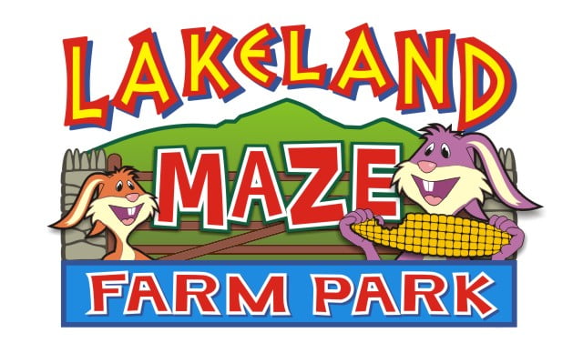
A new look for Lakeland
Mazescape was commissioned by Lakeland Maize Maze, one of our existing maize maze clients, to look at their maze branding and produce a new logo to help communicate their extended open season from April to October.
Lakeland Maze Farm Park is a successful farm diversification project run by Graham and Jane Wadsworth at their farm in Cumbria. The maize maze has been the main marketing anchor for the site since their first maze opened in 2004 and has grown steadily to be come one of the areas main farm attractions. Additional facilities have been added over the years and the open season extended from just the summer to April – October, including Easter and Halloween.
Lakeland did not want to completely throw out their existing image so they asked us to design a fun, character based logo that incorporated the existing style of title font but developed and strengthened for greater impact. The logo was also required to incorporate a sense of the landscape in the area.
One of the main issues that Lakeland had with their brand was that the name Lakeland Maize Maze was confusing for some visitors. Some thought that there would be a maze available all season and could be disappointed when they arrived at Easter, to find no maze. Others thought that because it was a maize maze, it would only be open in the summer and so did not realise that they could visit earlier in the year. Marketing leaflets and adverts were circulated from the early part of the season and Lakeland did not want to have to double up on the marketing for the non-maze period.
The solution was the create two similar logos which at first glance appear almost identical. Both contain the words Lakeland Farm Park, images of the landscape and rabbit characters, but where one version could include the word Maze for use during the maze season. This approach allowed the use of a single design of folded leaflet that could be folded differently to show the Farm Park or Maze Farm Park logo depending on the time of distribution.
The new logo has established the brand firmly in the area and has allowed the flexibility to differentiate the offer at different times of year, whilst retaining a strong unified look.